3.1.3 Setting element properties: Format dialog, Color tools
Element properties like colors, line style and weight,
position and size can be accessed and modified in the Format Dialog. To open it,
double-click the element. You can also first select the element then press
Enter, or select Format... from the element’s pop-up menu, or
select Format | Format... from the menu bar.
The line and fill colors, line style and weight for an
element can also be set from the formatting bar just below the drawing
area.
To change the formatting, select the element, press the
right mouse button to open its pop-up menu, and then select
Format...
from the menu. Double-clicking the element or pressing Enter when it is selected
will achieve the same result. A Format Dialog
similar to
that shown in
Figure 3–5 will
open. The exact tabs and contents will vary according to the element type, but
the three most common tabs are shown in the figure and described
below.
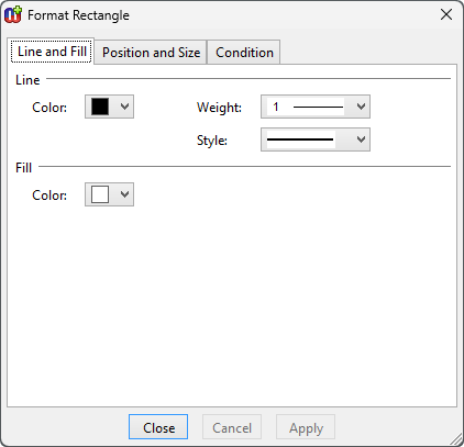
Figure 3–5. Format Dialog for line shape.
Line and Fill
The first tab,
Line and Fill (as
shown in
Figure 3–5), enables you
to change the color, style and weight of the line of the element, and the fill
color inside the element.
The line widths from hairline to 10 pixels can be chosen
from the
Weight menu. The line style (dotted, dashed etc.) can be set
from the
Style
menu
.
Colors
You can pick a color from the
Color pull-down list. If
there is no suitable color available in the pre-defined color palette, choose
Select a New Color... and define the color of your choice in the dialog
that opens (
Figure 3–6).

Figure 3–6. Selecting color.
The Select Color dialog
lets you select a color either by picking it from the palette or by entering its
HTML, RGB or HSV value. The HSV value can be also defined with the sliders
available above and to the left of the palette. An option for
Transparent
is also provided, as well as a preview comparing the old and new
color.
Fountain fills
Instead of a plain fill color it is also possible to use
fountain fills (also known as gradient fills: a gradual fade from one color to
another).
To set a fountain
fill
for a selected
element:
| 1) | From
the element's popup menu, select Edit Fill. This will set a default
gradient fill (a path fill from the current color to white) for the element and
activate the Fill Edit tool (as in Figure
3–7). |
Figure 3–7. Setting fountain fill for an element.
| 2) | By
default, there are two handles, one for each fixed color in the fill. To change
a color, move the mouse cursor on top of its handle and press and hold down the
right mouse button to open its color menu. Select the new color from the menu
(or create a new one by selecting Select a New
Color). |
| 3) | To
change the proportions and direction of the fill, you can move the color handles
freely within or around the element.
|
| 4) | It is
also possible to add more colors to the fill by double clicking the left mouse
button on an area between existing stop points. The new handle will have a fixed
color equal to the previous color at that point. You can change the color from
the pop-up menu of the new
handle. |
| 5) | Intermediate
color handles can be slid along the line of the fill to change the points of
their fixed colors. They cannot however be moved past each other on the line.
Only the outermost handles can affect the angle and length of the
line. |
| 6) | To
remove a color, press and hold down the Ctrl key and click the left mouse button
on top of the color handle you want to remove.
|
| 7) | To
change the fill type, press and hold down the right mouse button (not over a
handle) and select the fill type (path, radial, square or gradient) from the
popup menu that opens. From the same menu you can also turn gamma correction on
or off, if needed. Note that if you are using Cairo for rendering, only radial
and gradient fills are currently supported, with path and square fills rendered
as radial fills. |
Position and Size
The second tab in the Format Dialog,
Position and
Size, contains the values for the position, size and
scale of the element (
Figure
3–8). You can change these freely either by entering new values into
the fields or by using the spin buttons next to the fields. If you want the
element to retain its original aspect ratio when you are changing size or scale,
check the
Lock aspect ratio box.
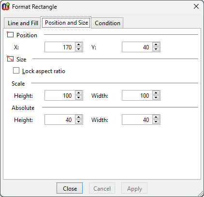
Figure 3–8. Format Dialog for shape’s position and size.
Condition
The final tab,
Condition,
controls the visibility of the symbol element (
Figure 3–9). All elements except
Connectables can have a condition that must be met for the element to be
displayed.
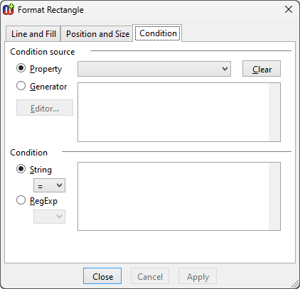
Figure 3–9. Condition dialog.
The conditions are
matched against either property values or generator outputs and the matching is
done with plain strings or regular expressions
. The
condition source is defined on the top part of the Condition tab. For property
condition source, select the Property radio button and select the source
property from the pull-down list next to it (the menu includes all the property
types defined for symbol’s non-property type). For generator source,
select the
Generator radio button and enter the
MERL code for the generator body (no name or header) into the text field next to
it (for more information about defining generators, see Section
5). Selecting the
Generator radio
button will enable the
Editor button – pressing this button will
open the Generator Editor for editing the MERL code for the generator.
The symbol element will be shown if the value of the
selected property or the output of the generator matches the condition string or
regular expression that is entered in the
Condition text box in the lower
part of the dialog. The type of the required match, either
String or
RegExp, is defined by selecting the appropriate radio button and choosing
the desired match operator from the accompanying pull-down list. The possible
match operators for String are
= (exact comparison),
=~ (wildcard
comparison),
<>,
<,
>,
<= and
>=; and for RegExp
= and
<>. In String wildcard
comparisons # (any single character) and * (0 or more characters) can be used.
More complex partial matches can be done with regular expressions. For more
information about how to use regular expressions, see
Appendix A: Regular
expressions.
When using Boolean properties as the condition source,
note that you should compare to T for Boolean value true and F for false (i.e.
checkbox checked and not checked).
To remove a condition completely, press the
Clear
button.


