3.3 Editing symbol elements
The Symbol Editor provides many editing options for elements.
These possibilities are discussed below.
Selecting elements for editing
Individual elements can be selected by clicking them with the
left mouse button. For connectables, you must click the target point. You can
also press Tab and Shift+Tab to cycle the selection through the elements by
their Z-order.
To select multiple elements, press and hold down the
Ctrl key and click them with the left mouse button. You can also select
multiple elements by defining a selection area with the mouse. Take the mouse to
a corner of the area you want to select, press and hold down the left mouse
button, drag the cursor to the other corner of the area, and release the mouse
button. All elements within the area will now be selected.
To select all the elements in the drawing area, press
Ctrl+A or select Edit | Select All from the menu bar.
Moving elements
To move a symbol element, simply drag it. The position of the
top-left corner of its area will snap to the current grid if Snap to Grid is
on.
You can also move the selected element or elements with
the cursor keys, providing keyboard focus is in the drawing area. The cursor
keys normally move the selection by the grid increment; if Ctrl is held down,
they move the selection by a single unit.
Connectables behave a little differently. To move the
whole connectable:
| 1) | Make
sure the connectable is not selected,
|
| 2) | Click and
drag the connectable’s target point in one
operation. |
To move the target point within the
connectable:
| 1) | Select
the connectable by clicking its target point and releasing the mouse
button |
| 2) | Click
and drag the connectable’s target point |
Scaling elements
To scale a symbol element:
| 1) | Select
the element first to enable the scaling handles around
it. |
| 2) | Pick the
handle you want to scale the element from and drag it until the element is
scaled as required. |
While scaling, holding
down the Shift key maintains the aspect ratio of the element. Holding down the
Control key makes the center of the element remain fixed while scaling: with
Control the top left corner of the element remains fixed.
If more precision is required, the scale and size of the
element can be fine tuned in the Format Dialog’s Location and Size
tab.
Only a single element can be scaled at a time. To scale
multiple elements together, first make them into a group.
Deleting elements
To delete the selected element(s), press the Delete
key, or select Delete from the pop-up menu or the Edit
menu.
Accessing and changing element properties
Element properties like colors, line style and weight,
location and size can be accessed and modified in the Format Dialog. To open it,
double-click the element. You can also first select the element then press
Enter, or select Format... from the element’s pop-up menu, or
select Edit | Format... from the menu bar.
The line and fill colors, line style and weight for an
element can also be set from the formatting bar just below the drawing area.
Please note, however, that line style settings can only be applied to line and
polyline elements.
Cutting, copying and pasting
To copy a symbol element, first select it and then:
 | press
Ctrl-C, |
| press
the Copy button in the Symbol Editor
toolbar |
| select
Copy from the pop-up menu, or
|
| select
Edit | Copy from the menu bar. |
To cut an
element, select it and press Ctrl-X. You can also press the Cut
button in the toolbar, or select Cut from the pop-up or Edit
menu.
To paste the element you copied or cut, press
Ctrl-V. You can also press the Paste button in toolbar, select
Edit | Paste from the menu bar, or select Paste from the
pop-up menu when nothing is selected.
Changing colors
By default, all symbol elements will be created with a black
line and text color and with a white fill (if applicable). To change a color of
an element, either:
| Use
the Format dialog's Line and Fill page to set line and fill colors (see
Section 3.2.1) and Text
Settings page to set the text color (see Section 3.2.7),
or |
| Select
line and fill color from the respective color menus on the status
bar. |
Instead of a plain fill color it is also
possible to use fountain fills (i.e. gradual fade from one color to another). To
set a fountain fill
for a selected element:
| 1) | From
the element's popup menu, select Edit Fill. This will set a default
fountain fill (a path fill from the current color to white) for the element and
activate the Fill Edit tool (as in Figure
3–15). |
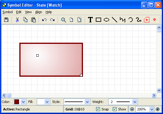
Figure 3–15. Setting fountain fill for an element.
| 2) | By
default, there are two handles, one for each fixed color in the fill. To change
a color, move the mouse cursor on top of its handle and press and hold down the
right mouse button to open its color menu. Select the new color from the menu
(or create a new one by selecting Select a New
Color). |
| 3) | To
change the proportions and direction of the fill, you can move the color handles
freely within or around the element.
|
| 4) | It is also
possible to add more colors to the fill by double clicking left mouse button on
an area between existing stop points. The new handle will have a fixed color
equal to the previous color at that point. You can change the color from the
pop-up menu of the new
handle. |
| 5) | Intermediate
color handles can be slid along the line of the fill to change the points of
their fixed colors. They cannot however be moved past each other on the line.
Only the outermost handles can affect the angle and length of the
line. |
| 6) | To
remove a color, press and hold down the Ctrl key and click the left mouse
button on top of the color handle you want to remove.
|
| 7) | To change the
fill type, press and hold down the right mouse button (not over a handle) and
select the fill type (path, radial, square or gradient) from the popup menu that
opens. From the same menu you can also turn gamma correction on or off, if
needed. |
Changing line weight and style
By default, symbol elements have solid line with weight value
1. To change these, either:
| Use
Line and Fill format dialog to set line style and weight (see Section 3.2.1),
or |
| Select
line style and weight the respective menus from the status
bar. |
Grouping elements
To group a set of elements:
| 1) | Select
all the elements that are to be
grouped. |
| 2) | Press
Ctrl+G, or select Group from the pop-up menu or Edit |
Group from the menu bar. |
When grouped,
operations such as changing a color will affect all members of the group for
which the operation is applicable. Conditions can also be applied to a group: if
the group condition fails, no elements of the group will be displayed; if it
passes, the condition of each element will also be evaluated.
To ungroup elements:
| 1) | Select
the group
element |
| 2) | Press
Ctrl+U, or select Ungroup from the pop-up menu or Edit |
Ungroup from the menu bar. |
Changing the order of elements
By default, any newly created symbol element is placed on top
of all other elements. To change the order of elements, first select the
affected elements. The commands to change the order are found in both the
Edit | Order menu and the pop-up menu’s Order
sub-menu.
| To
move the element(s) on top of all others press Ctrl+F, or select the
Bring to Front menu
action. |
| To
move the element(s) behind all others press Ctrl+B, or select the Send
to Back menu
action. |
| To
move the element(s) forward one step press Ctrl+Shift+F, or select the
Bring Forward menu
action. |
| To
move the element(s) backward one step press Ctrl+Shift+B, or select the
Send Backward menu action. |
Aligning elements
To align one or more elements relative to another
shape:
| 1) | Select
the element that you want to use as the basis of alignment (this element will
not
move). |
| 2) | Incrementally
select one or more other elements to align relative to the first element, by
keeping the shift button pressed while clicking the
elements. |
| 3) | Select
the type of alignment from the Align
menu. |
Available alignments are: left sides,
right sides, bottoms, tops, vertical centers, horizontal centers, centers, left
to right, right to left, bottom to top, and top to bottom. For example,
Bottom to Top will align the bottom of the other selected elements with
the top of the first element: they will effectively sit vertically above the
first element.


