3.2.1 Rectangle
Rectangle elements are used for filled and unfilled rectangles
and rounded rectangles.
To create a rectangle:
| 1) | Press
the Rectangle button in the
toolbar. |
| 2) | Move
the cursor in the drawing area to where you want a corner of the rectangle to
be. |
| 3) | Press and
hold down the left mouse button, drag the cursor into the point where you want
to place the opposite corner, and release the mouse
button. |
The resulting rectangle is displayed
in the drawing area. You can drag the yellow handle at the top-left corner
towards the center of the rectangle to round the corners of the
rectangle.
The default formatting for rectangle is solid, black 1
pixel line and white fill. To change the formatting, select the line, press the
right mouse button to open its pop-up menu, and then select
Format...
from the menu. Double-clicking the line or pressing Enter when it is selected
will achieve the same result. A Format Dialog
as shown in
Figure 3–7 will open.
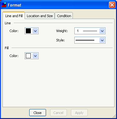
Figure 3–7. Format Dialog for line shape.
There are
three tabs in the dialog. The first one,
Line and
Fill (as shown in
Figure 3–7), enables you to change
the color, style and weight of the line of the rectangle, and the fill color
inside the rectangle. You can pick the line color from the
Color
pull-down list. If there is no suitable color available in the pre-defined color
palette, choose
Select a New Color... and define the color of your choice
in the dialog that opens (
Figure
3–8). The slider on the left controls the luminance of the colors
available in the main area. The columns each have a different hue, with
saturation increasing towards the bottom rows. Select a color by clicking a
colored square or using the sliders on the right, and press
OK.
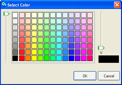
Figure 3–8. Selecting color.
The line widths from
hairline to 10 pixels can be chosen from the
Weight menu. The line style
(dotted, dashed etc.) can be set from the
Style
menu
.
The second tab in the Format Dialog,
Location and
Size, contains the values for the position, size and
scale of the element (
Figure
3–9). You can change these freely either by entering new values into
the fields or by using the spin buttons next to the fields. If you want the
element to retain its original aspect ratio when you are changing size or scale,
check the
Lock aspect ratio box.
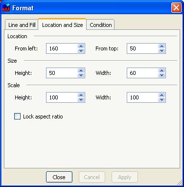
Figure 3–9. Format Dialog for shape location and size.
The
final tab,
Condition, controls the visibility of
the symbol element (
Figure 3–10).
All elements except Connectables can have a condition that must be met for the
element to be displayed.
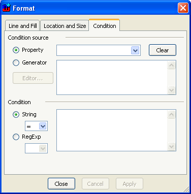
Figure 3–10. Condition dialog.
The conditions are
matched against either property values or generator outputs and the matching is
done with plain strings or regular expressions
. The
condition source is defined on the top part of the Condition tab. For property
condition source, check the Property radio button and select the source property
from the pull-down list next to it (the menu includes all the property types
defined for symbol’s non-property type). For generator source, check the
Generator radio button and enter the MERL code for
the generator into the text field next to it (for more information about
defining generators, see Section
5.3).
Checking the
Generator radio button will enable the
Editor button
– pressing this button will open the Generator Editor for editing the MERL
code for the generator.
The symbol element will be shown if the value of the
selected property or the output of the generator matches the condition string or
regular expression that is entered in the
Condition text box in the lower
part of the dialog. The type of the required match, either
String or
RegExp, is defined by checking the appropriate radio button and selecting
the desired match operator from the accompanying pull-down list. The possible
match operators for String are
= (exact comparison),
=~ (wildcard
comparison),
<>,
<,
>,
<= and
>=; and for RegExp
= and
<>. In String wildcard
comparisons # (any single character) and * (0 or more characters) can be used.
More complex partial matches can be done with regular expressions. For more
information about how to use regular expression, see
Appendix A: Regular
expressions.
When using Boolean properties as the condition source,
note that you should compare to T for Boolean value true and F for false (i.e.
checkbox checked and not checked).
To remove a condition completely, press the
Clear
button.


