4 Dialog Editor
The Object, Relationship, Role, Port and Graph Tools allow you
to open a Dialog Editor
to modify the layout of the
dialog used to edit the properties
of an instance of that
type. To edit the dialog layout:
| 1) | Select
Tools | Edit Dialog from the menu bar, or press the Edit Dialog
toolbar button. |
As
a result a dialog editor opens (as in
Figure
4–1), showing the layout and contents of a dialog for the type. In
other words, it shows the appearance of the dialog that the modeling tool user
uses when creating or editing an instance of this type.
Each widget in the dialog is determined by the data type
and widget type of its property type (a string is a single line field, text is a
text box, collection is a list box etc.). The labels are the local names of the
properties in this type.
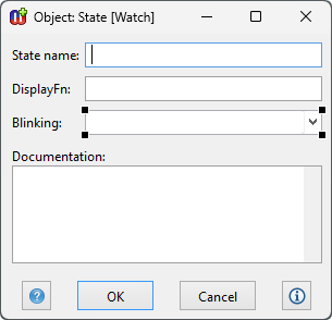
Figure 4–1. Dialog Editor.
Setting the font for a dialog component
The font used for displaying text in dialog component widgets
can be changed by selecting the component and choosing
Font... from its
pop-up menu. This opens a list of platform-independent text styles to pick from,
e.g. code or pixelFixed are good choices for a fixed width font for editing
program code. Choose the desired style and accept the selection by pressing
OK.
Location of dialog components
The location of any field or label can be changed by selecting
the item and dragging it to the desired location with the mouse (as in
Figure 4–1). You can also use the cursor
keys to move the element, Shift + cursor keys to move just its bottom or right
edge, and Ctrl + cursor keys to move just its top or left edge.
Several items can be selected for moving as one unit by
keeping the shift button down while selecting the items from the window, or by
dragging to select an area enclosing them. When dragging the selection, it is
possible to constrain the movement to happen only either vertically or
horizontally by holding shift as you begin the drag: the axis along which
movement is restricted is taken from the direction in which you first move the
selection.
Setting resize factors for dialog components
If the location of dialog components is changed you usually
must also set resizing information for dialog components. This is needed to
specify how individual property fields, labels and buttons are resized when the
whole dialog is resized. For this purpose MetaEdit+ offers the Position Settings
Tool for each dialog component (as in
Figure
4–2)
. To open a Position Settings Tool, select
a component and either select
Position... from the component’s
pop-up menu or press
Esc-L.
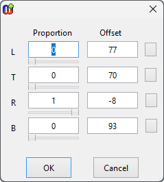
Figure 4–2. Position Settings Tool.
The
Position Settings Tool has a Proportion column and an Offset
column for each edge of a component: Left, Top, Right and Bottom. For components
whose width and height is calculated automatically, i.e. text labels, fields
show the origin’s X and Y co-ordinates, and the position of the origin
point within the component: normally 0 and 0, for the top left corner, but could
be 1 and 1 to make the bottom right corner the origin.
The proportion value for a dialog component’s edge
controls how much that side moves relative to the size of the property dialog
window. Values can be between 0 and 1, where 0 is the left or top of the window
and 1 is the right or bottom of the window. Thus setting it to 0 causes the
dialog component’s side to remain a fixed distance from the top or left
side of the dialog, and setting it to 0.5 will make the side remain a fixed
distance from the middle of the dialog.
Offset sets the desired distance to offset the
component’s side from the value given by the proportion. It may be
positive or negative. For example, a left proportion value of 0.5 and offset
value 50 means that the dialog element is located 50 pixels right of the middle
of the window. Thus the pixel position of the side is equal to the
window’s extent in that direction (width or height) multiplied by the
proportion value, plus the offset value.
The most common use for the Position Settings Tool is for
customized dialogs where you want dialog components to expand or shrink with the
window. This is done by setting the component’s right proportion to be
different from its left proportion, and/or by setting its bottom proportion to
be different from the top proportion. The latter is useful for dialog elements
like list and text fields which can use the additional height when the dialog is
resized vertically: input fields and other single-line fields normally have the
same proportion value for top and bottom sides.
By default, MetaEdit+ creates dialogs where all fields
have a left proportion of 0 and a right proportion of 1: thus resizing a dialog
horizontally makes each field grow to fill the extra width. Similarly, top and
bottom proportions of fields higher than a single line are set to different
values. Thus resizing a dialog vertically makes each field with more than a
single line grow to fill the extra height; the extra height is shared equally
among these fields. Each label is given the same top proportion as that of its
field, so it moves with that field. Finally, the buttons are always centered at
the bottom of the dialog.
To layout dialog components to resize with the window as
you wish, you should first get the layout right for a given size of the
window:
| 1) | Drag
from the top left corner to nearly the bottom right corner to select all the
labels and fields, but not the
buttons. |
| 2) | Press
Esc-f. This changes all of the components to have a fixed position, i.e.
sets their proportion fields to zero, but without changing their visible
positions. Having fixed positions makes getting the basic layout right
easier. |
| 3) | Resize
the whole dialog to be twice as wide (assuming you want to place the fields in
two columns). Move the desired fields and their labels into the space on the
right to make two columns. Resize the dialog again to be the right height (the
buttons will follow the bottom edge of the dialog). Now you should have the
dialog elements in their intended location for this size of dialog: adjust their
positions if necessary. |
Now that you have
the layout right in this size, you can set the proportion values for the
components so that they will move and resize appropriately when the window is
resized:
| 4) | Select
a dialog component, open its Position Settings Tool with
Esc-L. |
| 5) | Clear
all the offset values by clicking the small buttons on the right hand side of
the offset fields. This means that when you make a setting in the proportion
field, the value in the offset is automatically adjusted so that the component
side remains in the same position as it is currently. Thus you can safely adjust
the proportion values, without the component moving around the dialog away from
its desired
position. |
| 6) | If
the component is in the left column, set its left proportion to 0, and its right
proportion to 0.5. Similarly, if it is in the right column set its left
proportion to 0.5 and its right proportion to 1.
|
| 7) | Set the
bottom proportion (B) to a value that is larger than the top proportion (T). If
you have four fields that could be relative above each other, set the first
one’s top proportion to 0 and its bottom proportion to 0.25, and the
second one’s top proportion to 0.25 and bottom proportion to 0.5
etc. |
| 8) | The
offsets are calculated automatically once you press the Apply or OK
button. Alternatively, you may set the exact pixel distance from the
imaginary proportion line by hand. |
The
resulting setting is shown immediately in the dialog, and you can test it by
resizing the dialog window: the component should behave as expected, but other
components that have not yet been set will not move. You may continue in this
way to select and position other dialog
elements.
Aligning dialog components
Sometimes several components need to be aligned or distributed
relative to each other. These operations can be performed by selecting first the
components and then the appropriate commands from the pop-up menu.
To align
a group of widgets, select
them keeping the shift key pressed and select
Align... from the pop-up
menu. In the Align dialog (see
Figure
4–3) select the
On Vertical Line option to align widgets in a
column. To align widgets side by side, select
On Horizontal Line. Select
First Selection to align widgets with the first widget that was selected.
Select
Merged Box to align the widgets on a line halfway between the most
extreme positions within the group of widgets. To align the edges of the widgets
select either
Left Edges, or
Right Edges, or
Centers.
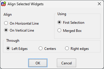
Figure 4–3. Alignment dialog.
Distributing dialog components
After making modifications it is often necessary to equalize
spaces between a group of widgets. This can be done by selecting
Distribute... from the pop-up menu. In the
distribute dialog (
Figure 4–4),
select
Left To Right for widgets that are to be evenly spaced
horizontally. Select
Top to Bottom for an even vertical spacing. The type
of spacing can be set either as
Equal Spacing Between Centers or
Edges, which distribute all elements between the outermost two, or as
Constant Spacing Between Edges. If you choose constant spacing, you have
to specify the constant, the number of pixels between each pair of widgets. The
widgets are then spaced using that constant, starting from the top or leftmost
widget.
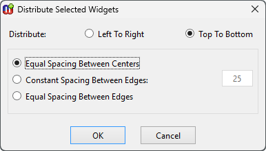
Figure 4–4. Spacing dialog.
Equalizing dimensions
Series of widgets can be forced to adopt the same width,
height or both by choosing
Equalize... from the
pop-up menu. The size can be equalized using the first of the selected objects
as the size for others, or then you can set the minimum or maximum of the sizes
to be used for all. If you want the size to be a certain number of pixels, that
can be set in the
Constant box.
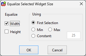
Figure 4–5. Equalize dialog.
Order of fields
When a user opens a property dialog for an instance, the
cursor is initially in a certain field (by default, the first property of that
type). By pressing Tab, the user can advance through all the fields, and finally
to the
OK,
Cancel and
Info... buttons. This tab order of
the fields can be set by keeping the shift key pressed and selecting the
widgets, in the order in which the tabbing should advance the focus, and
selecting
Tab Order from the pop-up
menu.
Dialog size
By default each dialog has a fixed size in which it opens in
modeling tools. This size is determined automatically after ordering the
property fields and related labels below each other.
If the opening size of the default dialog is not suitable
you may change it by simply resizing the window with the mouse, and closing it,
accepting changes. You may also set the minimum and maximum sizes for the
property dialog, by scaling the window to the required size and then selecting
either
Set Minimum Size or
Set Maximum Size. Normally, the minimum
size is set to be the smallest size at which all components are visible, and
components with more than one line of text are showing roughly two lines. The
maximum size is not normally set. After setting minimum or maximum sizes,
remember to return the window to an appropriate default size before saving your
changes.
Scroll bars
If the window’s height is such that it would not fit on
the current display, the system automatically turns on the vertical scroll bar.
If the scroll bar is not needed it can be turned off by selecting
Toggle
Vertical Scroll Bar from the pop-up menu.
In some cases you might also want to use horizontal scroll
bar: for example to hide some rarely needed design information and to make the
size of property dialogs smaller. To turn it on or off, select
Toggle
Horizontal Scroll Bar from the window’s pop-up
menu.
Removing, cutting and pasting components
In some circumstances, for example when using subclasses of
existing types, there may be a need to delete a field from the dialog. The field
can be deleted by selecting the field and pressing the delete button from
keyboard. Note that the users can not give values for a property whose input
field has been removed, but the property is still stored, with its current value
(or default empty value for new objects).
The most recently deleted selection can be added back into
the window with Alt+V or Ctrl+J. This allows even multiple
selections to be cut and pasted between dialog editors. Be aware however that
property entry fields are specific to a given type. They can only be copied for
a given property in a given non-property type if they are defined in the same
type (this type or a common supertype), and that property in that type does not
change between the cut and paste. Labels and buttons can be cut from any dialog
editor, and pasted into any other dialog editor, regardless of which type the
dialog represents.
Cutting and pasting dialog elements is most useful when
building a custom dialog that extends an existing custom dialog with new
properties. This can happen when sub-typing an existing type and adding a new
property, or adding a new property to an existing type.
| 1) | Open
a Dialog Editor for the existing supertype, or the type before the property
addition. |
| 2) | Select
all the elements in the dialog by clicking and dragging to define an area
totally enclosing them
all. |
| 3) | Leave
this dialog editor open while you perform your change to the existing type or
create a subtype, making sure you generate a new default dialog for that
type. |
| 4) | Open
a Dialog Editor for the new or changed
type. |
| 5) | Select
all the components of the new default dialog, except the labels and widgets for
the new
properties. |
| 6) | Press
the Alt+X or Delete key to cut these elements of the new default
dialog. |
| 7) | Resize
the second dialog editor to the right size and shape to accommodate the old
custom layout plus the new properties. Move the new properties to their desired
place. |
| 8) | In
the first dialog editor, press Delete to cut the corresponding elements. This
overwrites the contents of the cut buffer from step 6 above.
|
| 9) | In the
second dialog editor, press Alt+V or Ctrl-J to paste the elements
from the buffer. Finalize the layout, and close this dialog editor, installing
this new
definition. |
| 10) | Close
the first dialog editor; do not agree to install the
definition. |
Care should be taken in this
procedure, especially in making sure that the cut property fields are defined in
the same type. If incorrect property fields are present in a dialog, that dialog
will not be able to open, preventing editing and creation of instances of that
type. In this case, you should rebuild the default dialog for the
type.
Abstract and read-only properties
Abstract and read-only properties affect the visibility and
behavior of the property dialog widgets. If a custom property dialog has
read-only widgets (i.e. whose property slots were read-only at the time the
dialog was created), they will be maintained as read-only even if those property
slots no longer are. On the other hand, editable widgets that have become
read-only will be opened read-only. Similarly, if a custom property dialog has
visible widgets whose slots are now marked as hidden, those widgets will be
hidden (their labels still remain visible even if the values are
hidden).
Closing a Dialog Editor
The new window specification can be saved by closing the
window and answering yes to the dialog that asks whether or not the changes
should be saved.


